Introduction
The Nothing phone has been in the rumor mill for months, but the wait is finally over. Carl Pei, the company's CEO, has introduced the world to the Nothing Phone (1) over a simple, straight-to-the-point presentation, which was unexpected for such a hyped product, yet one that felt right. So, here it is, meet the Nothing Phone (1).
The company's first smartphone seems to have been built abiding by one simple rule - everything you need, nothing you don't. And a pinch of innovation, of course. And looking through the Nothing Phone (1) specs, we can clearly see this applied through and through.
The Nothing Phone (1) utilizes a 6.55-inch OLED of 1080p resolution and 120Hz refresh. And because of this rather mainstream display, the phone doesn't really need the latest Snapdragon chipset. That's why Nothing has opted for the competent, albeit not top-tier, Snapdragon 778G+ 5G chipset, which has already proven itself.
The camera department seems quite down to earth, too, but enough, nevertheless. There is a 50MP dual camera over at the back - a primary with a wide-angle OIS lens and an ultrawide-angle secondary with AF. A 16MP selfie camera is on the other side, sitting within a tiny display punch hole.
Then, you'd also find a 4,500mAh battery with 33W wired and 15W wireless charging support. Reverse wireless charging is also available.
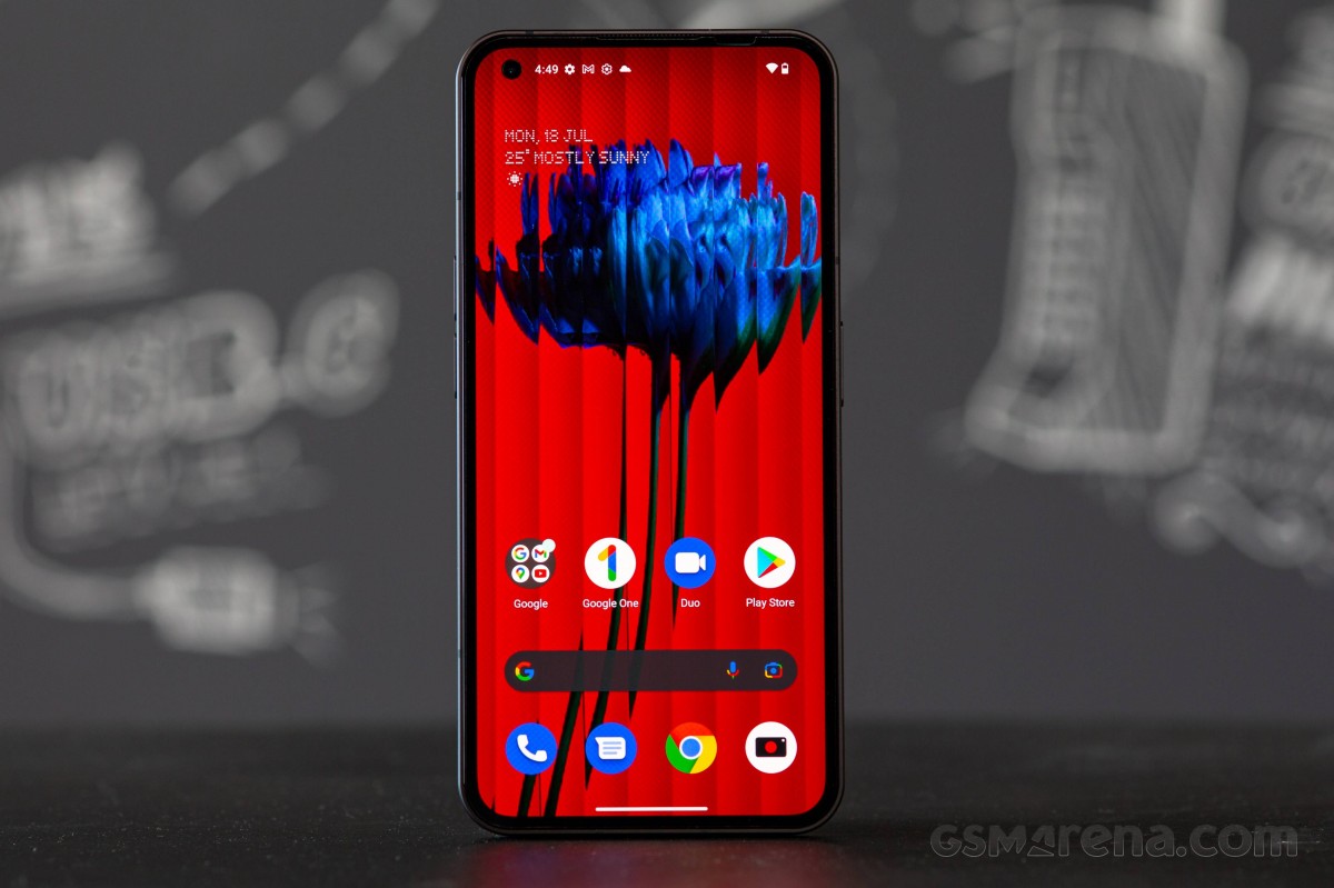
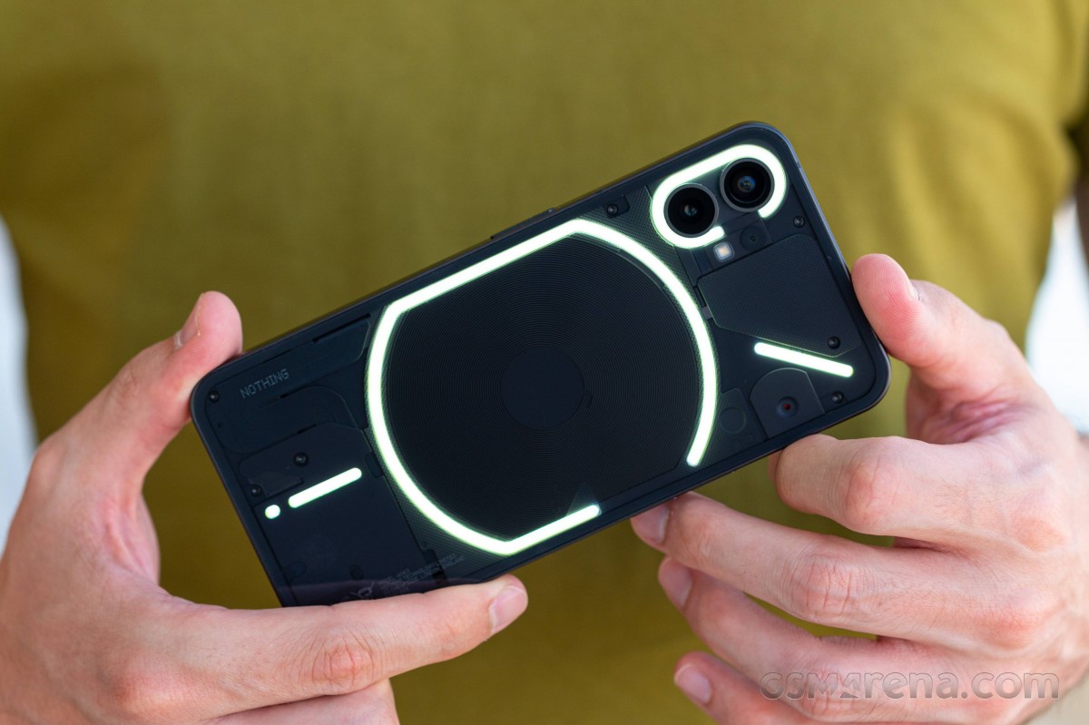
The strength of the Nothing Phone (1) lies elsewhere, though. First, it's the splash-resistant unique transparent design, second - the incredibly snappy Android 12 with Nothing interface, and finally, the unique Glyph illumination interface on the back. These make the Nothing Phone (1) stand out among any crowd. So color us intrigued!
Not offering cutting-edge technology is surely a risky move, but you can't make a €450 flagship in 2022. Not like it was with the first OnePlus phones eight years ago. And that's why we think it was a smart move to get a phone with the most useful features and not overpay for extras you will rarely (if ever) use, like a LiDAR, a 4K screen, an overpowered chip that ruins battery life.
See, we managed to avoid nothing jokes up to this part, and for that, we are already proud of ourselves. So, before we give in to the temptation, let's go through the detailed specs sheet.
Nothing Phone (1) specs at a glance:
- Body: 159.2x75.8x8.3mm, 194g; Glass front (Gorilla Glass 5), glass back (Gorilla Glass 5), aluminum frame; Multiple LED lights on the back (notifications, charging progress, camera fill light), Blinking red light on the back (video recording indicator), IP53 - splash, water and dust resistant.
- Display: 6.55" OLED, 1B colors, 120Hz, HDR10+, 500 nits (typ), 1200 nits (peak), 1080x2400px resolution, 20:9 aspect ratio, 402ppi.
- Chipset: Qualcomm SM7325-AE Snapdragon 778G+ 5G (6 nm): Octa-core (1x2.5 GHz Cortex-A78 & 3x2.4 GHz Cortex-A78 & 4x1.8 GHz Cortex-A55); Adreno 642L.
- Memory: 128GB 8GB RAM, 256GB 8GB RAM, 256GB 12GB RAM; UFS 3.1.
- OS/Software: Android 12, Nothing OS.
- Rear camera: Wide (main): 50 MP, f/1.9, 24mm, 1/1.56", 1.0µm, PDAF, OIS; Ultra wide angle: 50 MP, f/2.2, 114˚, 1/2.76", 0.64µm, PDAF.
- Front camera: 16 MP, f/2.5, (wide), 1/3.1", 1.0µm.
- Video capture: Rear camera: 4K@30fps, 1080p@30/60fps, gyro-EIS, live HDR; Front camera: 1080p@30fps.
- Battery: 4500mAh; Fast charging 33W, 50% in 30 min, 100% in 70 min (advertised), Wireless charging 15W, Reverse wireless charging 5W, Power Delivery 3.0, Quick Charge 4.0.
- Misc: Fingerprint reader (under display, optical); NFC; stereo speakers.
The only major omission we can spot right out of the bat is the lack of complete ingress protection. Sure, splash resistance is still something, but for a phone of such hype level, we expected at least IP67.
The Nothing Phone (1) is available in two color options - black and white - and three memory variants - 8/128, 8/256, and 12/256. The base model starts at €469, which is quite a reasonable price given, well, everything.
Everything boils down to one question - is the Nothing Phone (1) a breath of fresh air, a new hope if you will, or a glorified and overpriced mid-ranger? Let's find out!
Unboxing the Nothing Phone (1)
Nothing Phone (1) ships in an eco-friendly box made from recycled fiber. It gets destroyed upon opening, and unless you tape it back, it will never look the same.
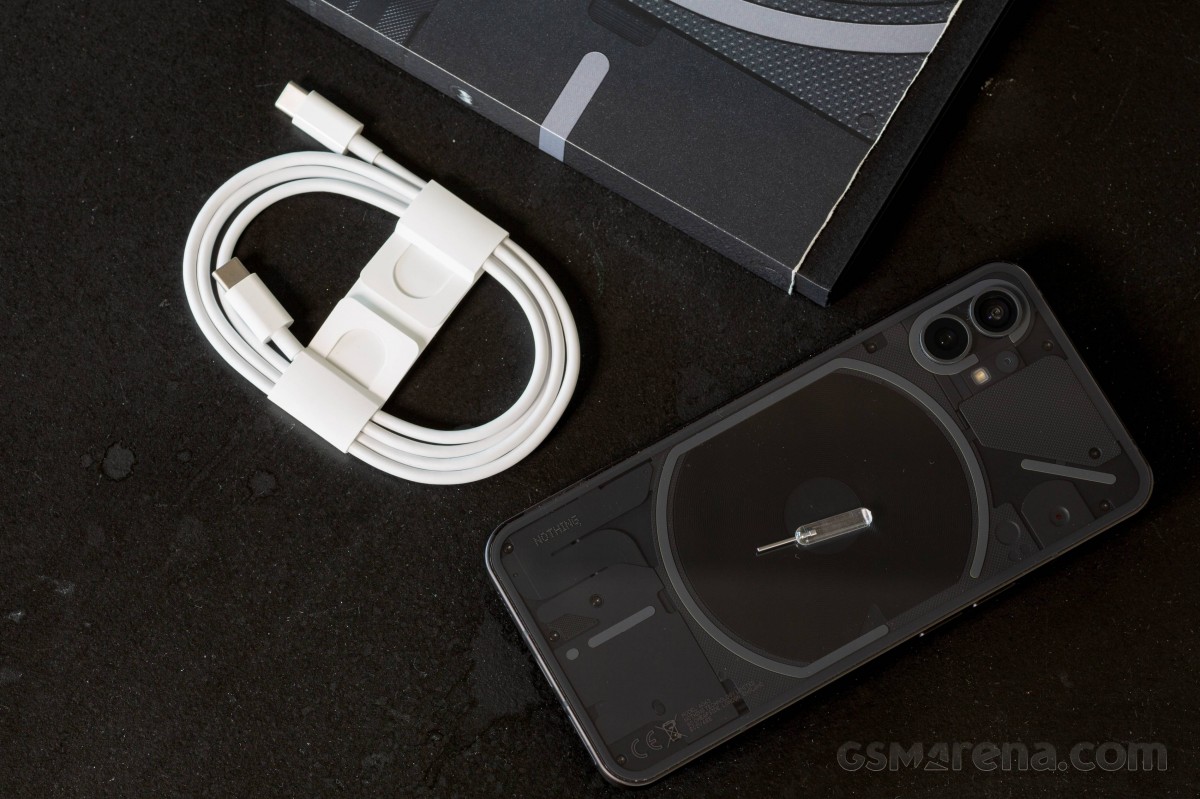
So, once you rip that paper box open, inside, you will find the Nothing Phone (1), a USB-C cable, and the coolest SIM ejection tool we've seen to date!
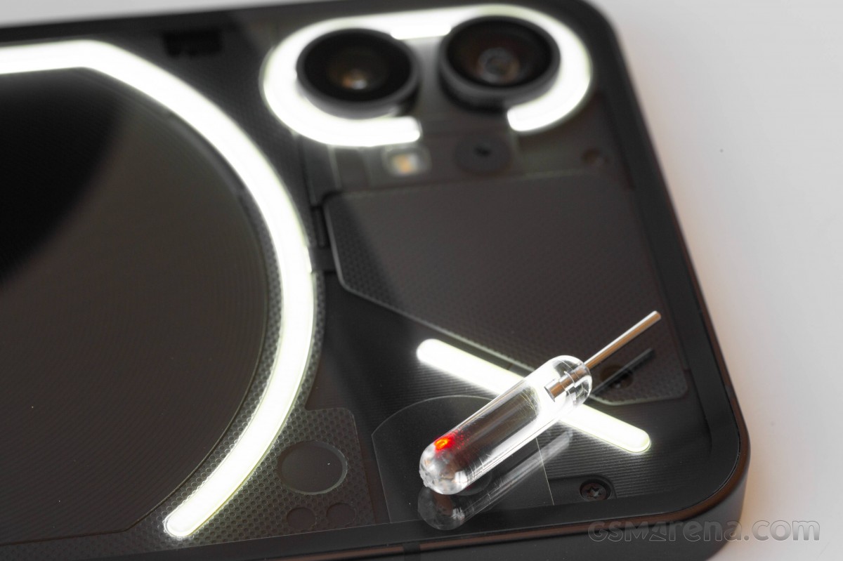
There is no charger inside the box. The phone supports USB-PD 3.0, so you can use any PD charger you have at your home.
One more thing, the Nothing Phone (1) comes with a thin screen protector that was applied in the factory. It is of a higher than usual quality and doesn't get as smudged as the ones coming on multiple Xiaomi phones.
Design, build quality, handling
The Nothing Phone (1), being the company's first smartphone, had to make an impression, and it had to make it right. The expectations for the design were particularly high, and we are happy that Nothing indeed succeeded in making an outstanding first impression!
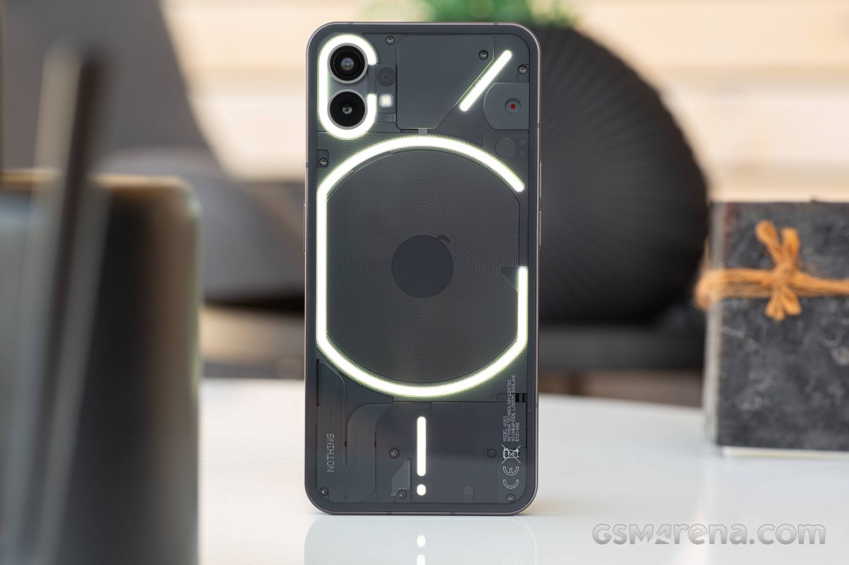
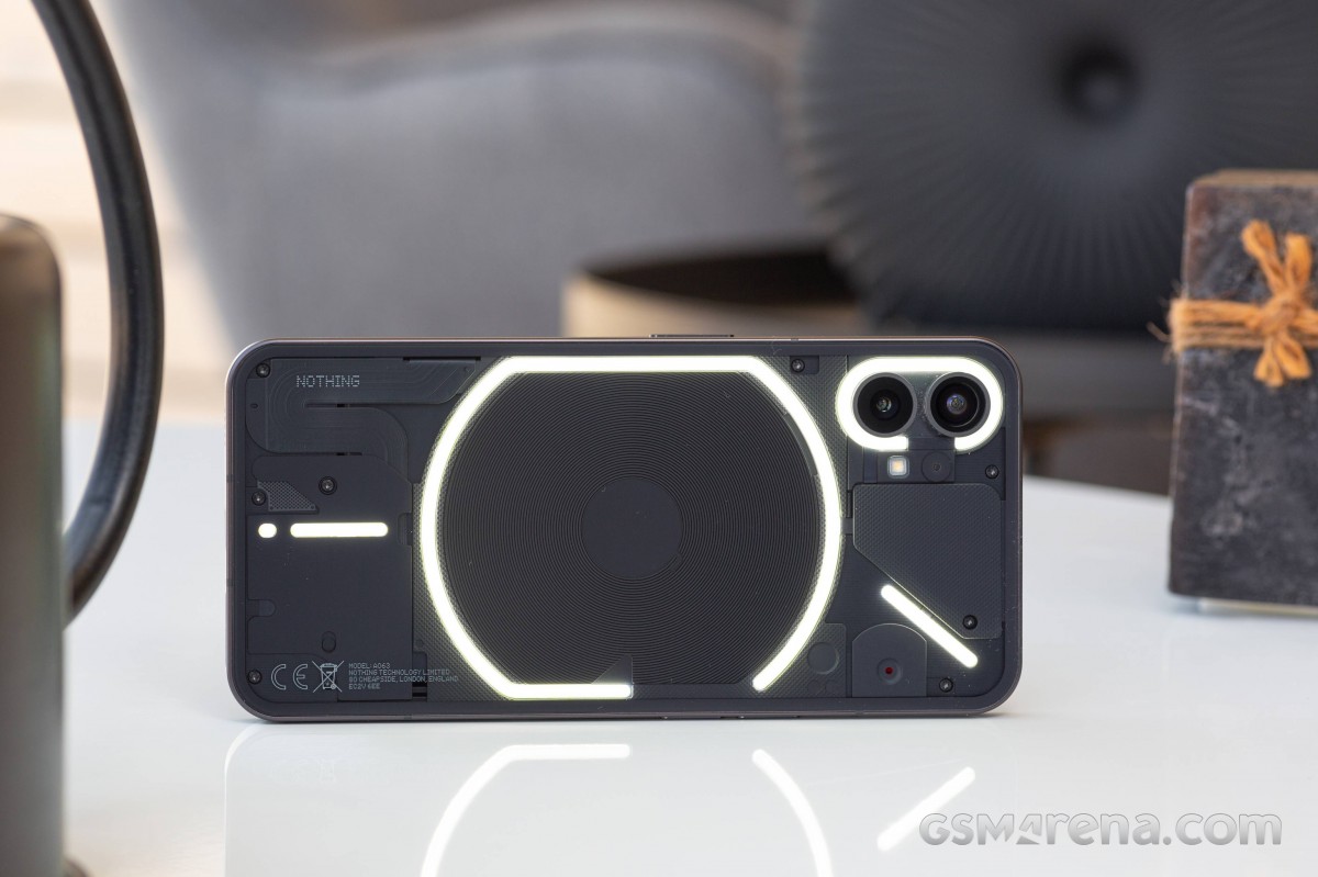
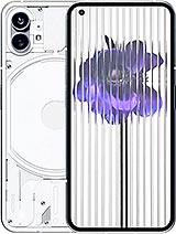
Nothing Phone (1) has two signature bits that will probably remain for at least a few generations - the see-through rear glass and the Glyph LEDs under that glass.
Besides the unique looking back panel, the Phone (1) features the usual high-quality build of two flat Gorilla Glass 5 pieces and an aluminum frame and chassis in-between. The whole thing is IP53-rated for dust and light splash resistance. It would have been nicer to get complete water protection, IP67-rated or more, but it is what it is. After all, we are not looking at a flagship here.
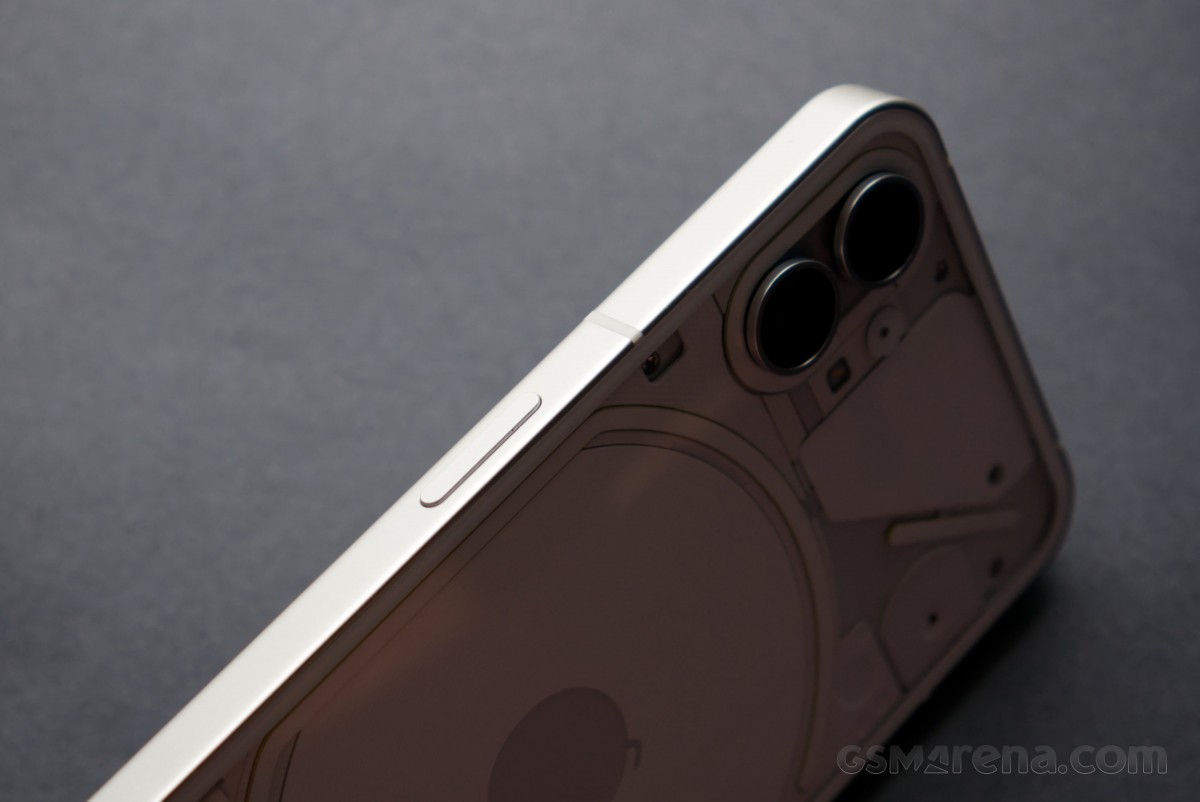
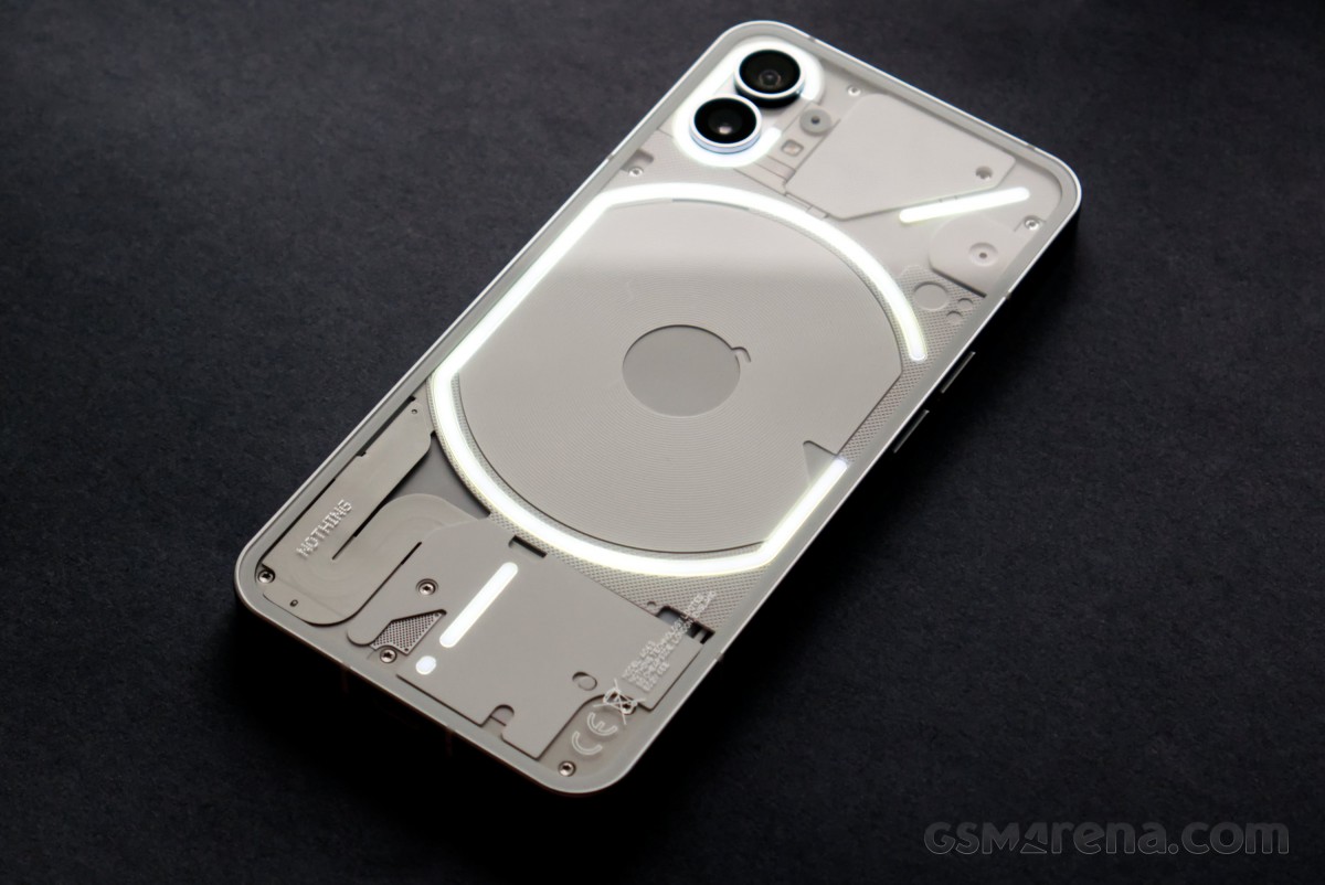
The Nothing Phone (1) is available in either Black or White colorways, and we have them both. The main difference is obviously the design of the backside. The frame on both variants has a matte finish and is painted dark gray.
And speaking about the frame, it's incredibly flat, and the Phone (1) can stand on its own, like some iPhones. It's not an achievement of any importance, but it speaks well for the overall balance of the device's design.
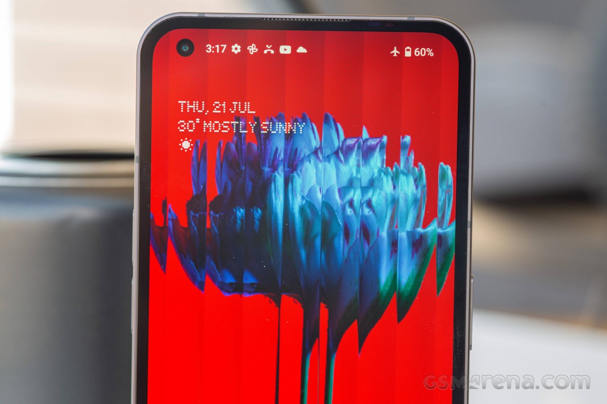
Starting with the front, we can see that the Phone (1) has more than a passing resemblance to modern OLED iPhones. The Gorilla Glass 5 is completely flat and perfectly flush with the frame. The bezels around the display are uniform, and Nothing is using the same flexible OLED tech that Apple uses to curve the display controller under itself in order to reduce the size of the bottom bezel. The only real difference is the presence of a hole punch camera in the top left instead of Apple's infamous notch.
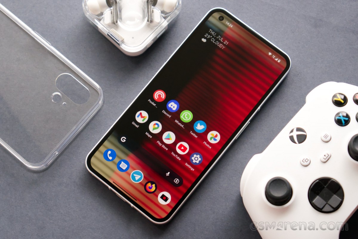
Nothing has used an optical fingerprint scanner placed under the display. It's about 1cm away from the bottom, a bit lower than on most phones, but we found its placement comfortable. Plus, the scanner is always-on and offers notably good speed and accuracy.
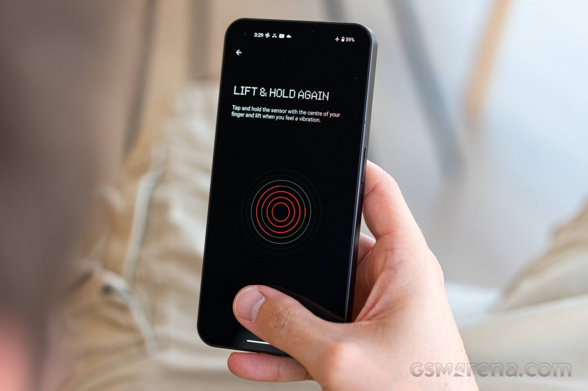
Above the screen, right next to the top part of the frame, you can spot a small outlet with a barely visible grille. This is where one of the stereo speakers, also acting as an earpiece, goes. An actual proximity sensor is hidden within the black bezels, so you don't have to worry about mistouches during calls.
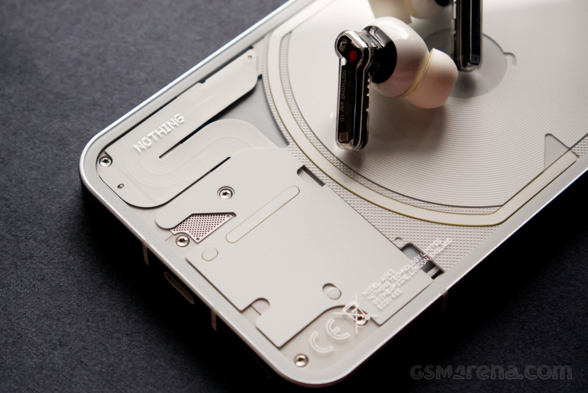
The back is where things get interesting. A transparent Gorilla Glass 5 panel covers the entire surface, giving a view of some of the components. It also lets the Glyph Interface lights shine through.
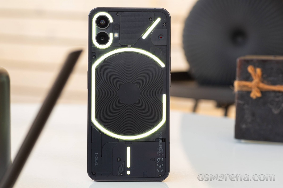
Of course, the clear design is mostly window dressing. You don't actually get to see the phone's internals because most of it is hidden behind plastic covers. The only identifiable components visible are the induction coil for the two-way wireless charging and a ribbon cable, presumably for the battery.
If you were expecting to see actual components like motherboard, battery, and speaker, you might end up disappointed, though. What you get is a sea of oddly shaped bits and pieces.
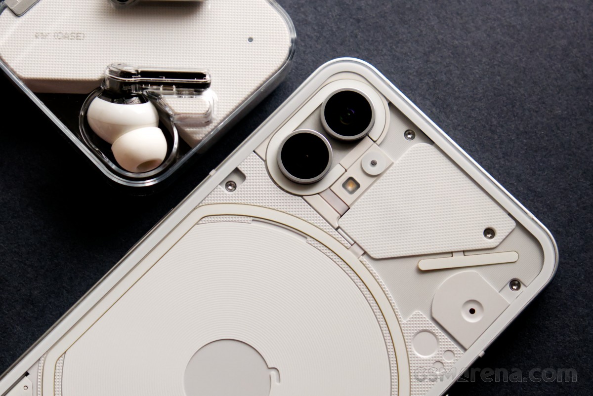
The black version looks more subdued, while the white model looks busier and somewhat flashier. Both have a certain charm to them; you just need to pick the one that you like better.
The only practical reason for the back to be transparent is for the Glyph Interface lights to shine through. These four sets of LEDs can be controlled through the software (more on that later) and are essentially used to indicate calls, notifications, and charging status. They can also be used as a fill light for the camera.
The LEDs can get extremely bright, to the point where we don't recommend keeping the phone near your eyes when they are about to light up. Their color is somewhat inconsistent, and there is some yellowing noticeable on some of the strips. However, this is not usually noticeable as they normally blink very rapidly.
And something you won't see right away is a small red LED that can flash while you are capturing videos. It's turned off by default from within the Camera app.
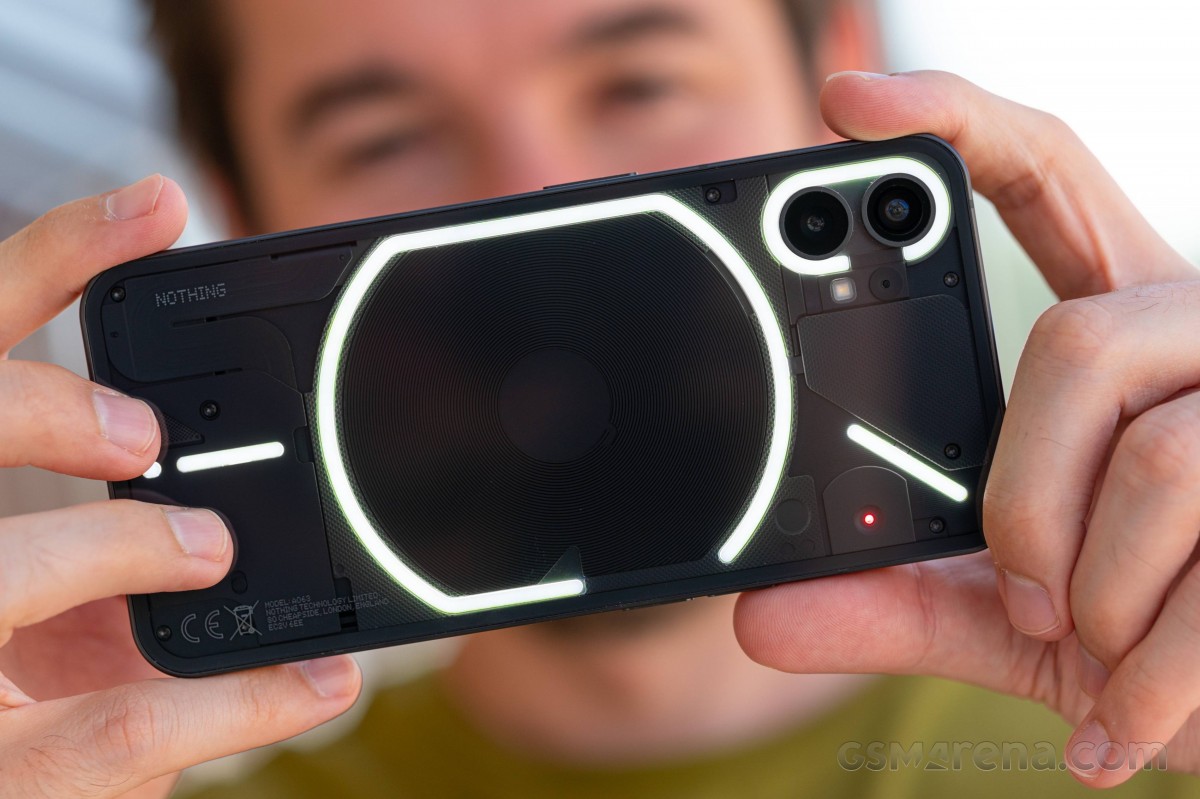
The Glyph is unique and useful; no two ways about that. But, to get any value out of it, you have to be someone who puts their phone face down, which is not something most of us do often. With the advent of always-on displays, there really is no reason to put your phone face down, as you'd miss out on quite a lot of useful information. With AOD, you get up-to-date information on all incoming calls and notifications whereas the lights on the back can only really identify a certain caller using custom ringtones but are otherwise quite vague as a notification system.
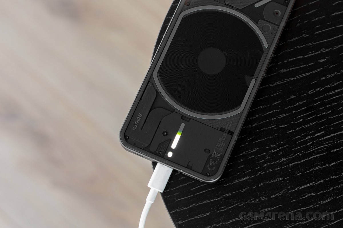
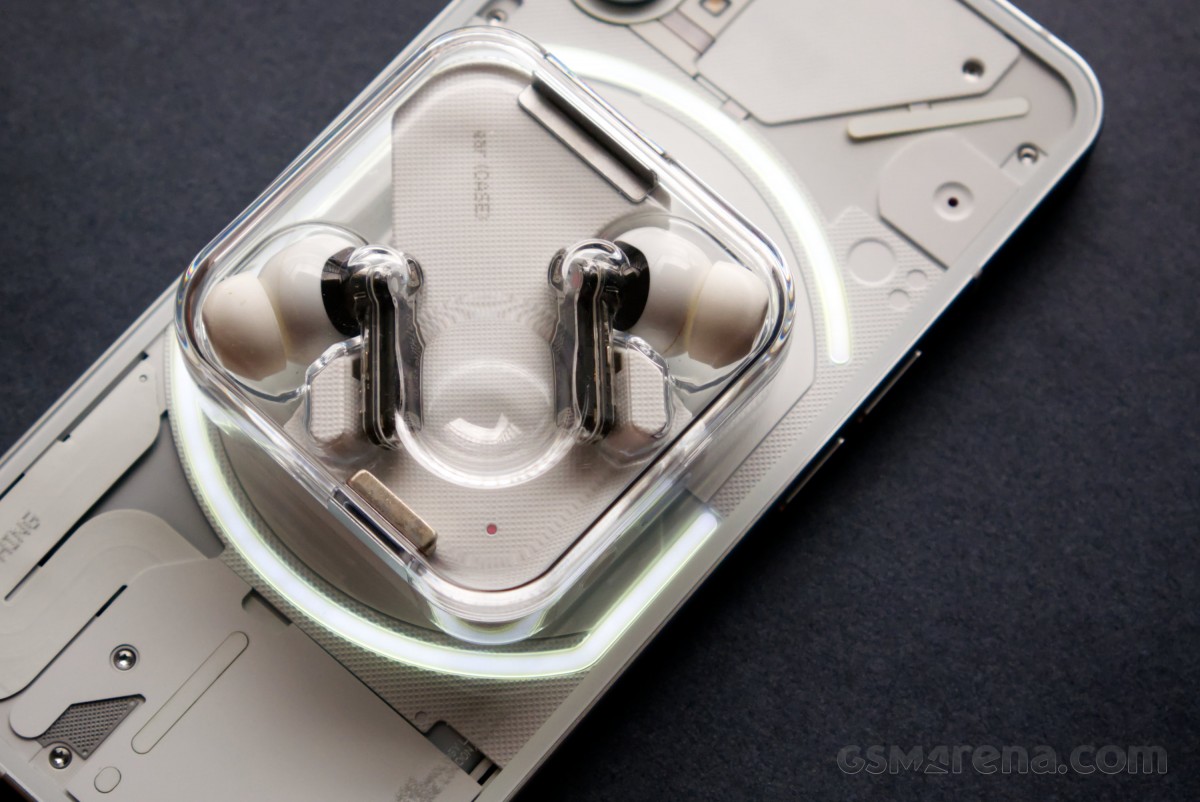
We do admit it's cool to wirelessly charge headphones or smartwhatches, or simply charge the Phone (1) and enjoy the slowly increasing battery indicator. The different notification Glyph patterns are cool, too. But for that, you will have to completely change your habits. And probably leave the factory screen protector on or even apply a higher-grade one.
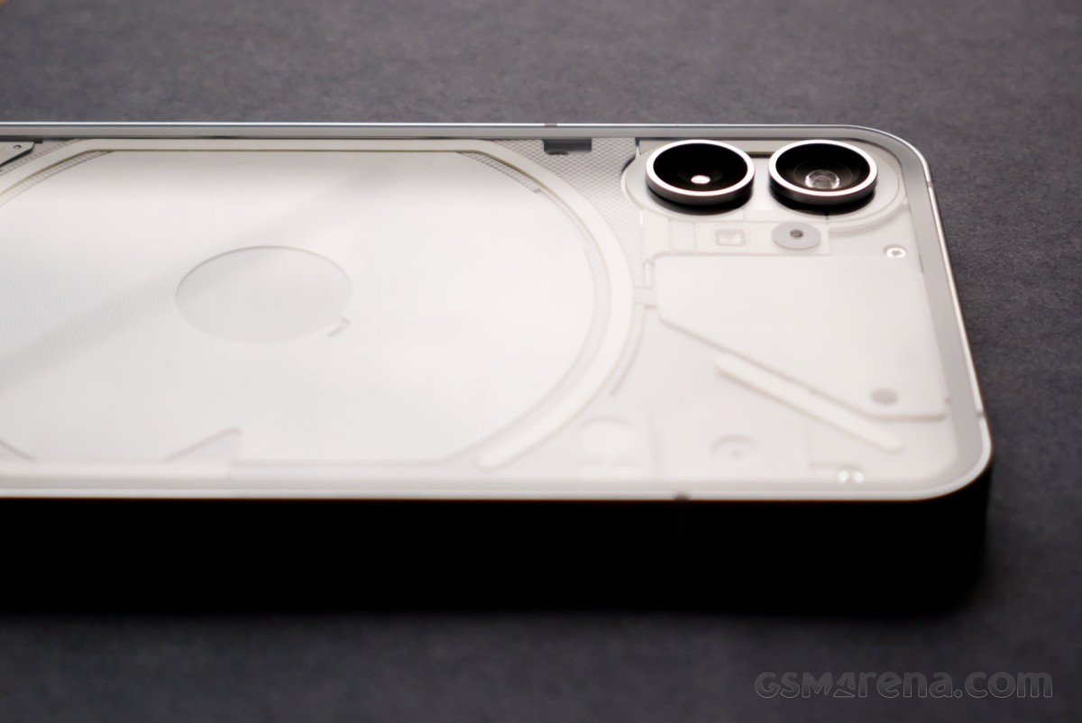
There are two jutting-put metal rings on the back - each circling a 50MP camera. The top one is ultrawide, while the bottom one is the primary wide-angle camera with OIS. A single LED flash is also around. The Nothing Phone (1) is wobbling a bit on a table because of that, but not as much as many recent phones. Though, since you are supposed to keep it lying on its face, that will hardly be an issue, right?
The sides of the Nothing Phone (1) also remind us of the regular iPhone models. They are completely flat, while the power and volume buttons are split across them in a similar fashion. We would have appreciated it if Nothing had gone all the way and also borrowed the alert slider, coincidentally also found on OnePlus phones.
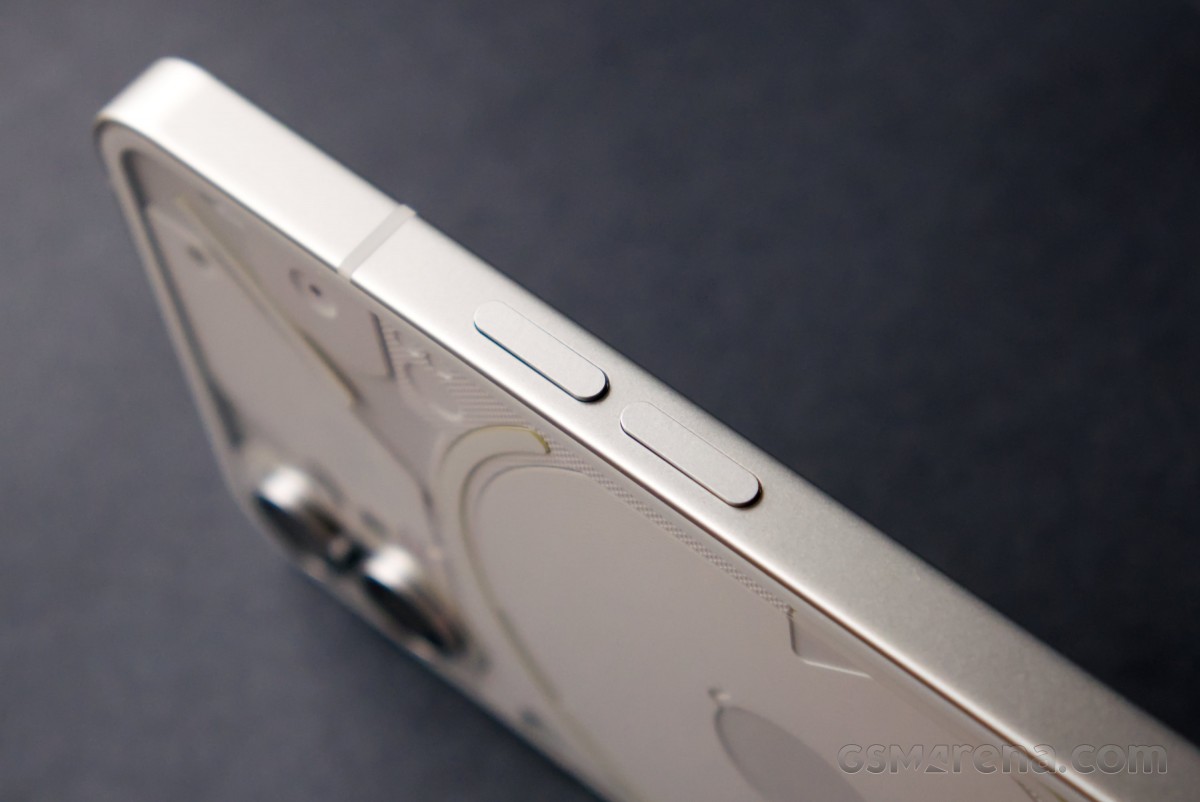
And there is the power/lock key on the right side.

The top of the phone houses a lonely microphone, one of three actually. Another one sits next to the dual camera on the back, and the primary one is at the bottom, next to the USB-C port.
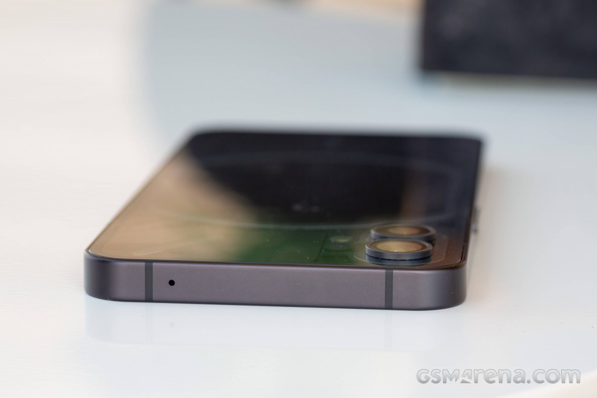
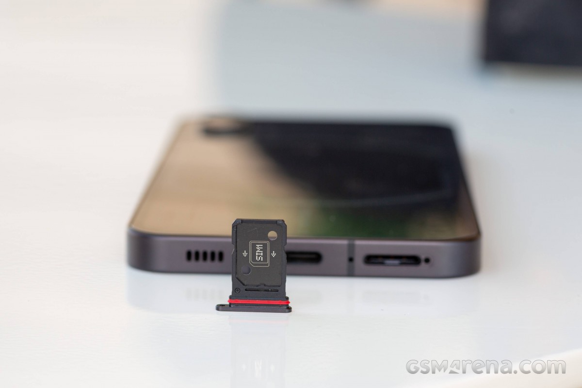
The bottom is also where you'd find the dual-SIM tray and the second stereo speaker.
In terms of usability, the Nothing Phone (1) is quite large, almost as much as the iPhone 13 Pro Max. This, coupled with the flat sides, does make the phone awkward to use if you are used to smaller phones.
The build quality of the Phone (1) is solid. The glass and aluminum surface feels premium, and things like panel gap tolerances are very tight. The buttons on the side feel firm and have good tactile feedback. Another positive thing we found is the incredibly easy-to-clean glass panels - a single wipe is enough to bring them back to pristine condition. Even better, fingerprints and smudges are not as easy to stick as on other phones. We'd go and throw a wide guess that maybe the Phone (1), just like the iPhones, comes with oleophobic coating.
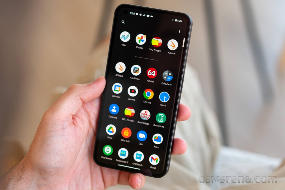
The Phone (1) also has IP53 rating for dust and water resistance, which is somewhat of a bare minimum as far as IP ratings.
Overall, we credit the Nothing Phone (1) for being interesting and standing out from the sea of black and gray phones on the market. Some can argue it would have been cooler if we had a look at the actual insides of the phone instead of this prettied up, sanitized version.
But complete transparency could have costed the beauty of the Glyph UI, which needs all the attention it can get as its coolness and usability may fade rather fast.
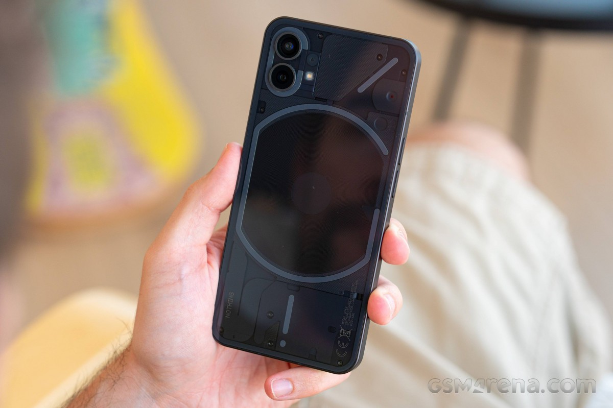
Long story short - the Nothing Phone (1) marks the beginning of a brand-new series of devices, and it does it the right way. Only time will tell if Glyph leaves a mark in the history books, but as a phone - this device has a solid, no-nonsense build with a premium touch that is easy to like right out of the box.
Display
The Nothing Phone (1) employs a 6.55-inch OLED of premium quality - it offers 10-bit color depth and can display up to 1B of colors; there is 120Hz refresh rate, 240Hz touch rate, and HDR10+ support. The resolution is the traditional extended 1080p resulting in a sharp 402ppi density.
The panel has a small perforation around its top left corner to make way for the selfie camera. Gorilla Glass 5 piece is responsible for the protection, while the phone also ships with a thin but of premium quality pre-applied film for extra scratch-protection.
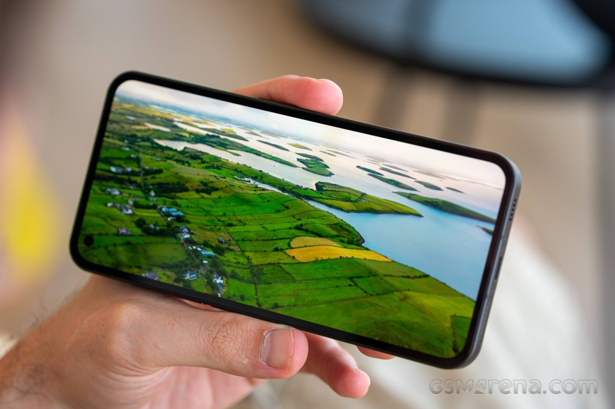
The Nothing's official page mentions 500 nits of typical brightness and up to 1200 nits of peak brightness (the latter only achievable in certain HDR video scenarios which we don't test).
Our display measurements captured 462 nits of max brightness and 663 nits of max brightness in Auto mode.
The minimum brightness at point white was just 2 nits - on par with most of the OLEDs these days and considered an excellent one.
| Display test | 100% brightness | ||
| Black, | White, | ||
| 0 | 466 | ∞ | |
| 0 | 663 | ∞ | |
| 0 | 383 | ∞ | |
| 0 | 800 | ∞ | |
| 0 | 507 | ∞ | |
| 0 | 824 | ∞ | |
| 0 | 437 | ∞ | |
| 0 | 634 | ∞ | |
| 0 | 427 | ∞ | |
| 0 | 830 | ∞ | |
| 0 | 438 | ∞ | |
| 0 | 633 | ∞ | |
| 0 | 468 | ∞ | |
| 0 | 761 | ∞ | |
| 0 | 530 | ∞ | |
| 0 | 1003 | ∞ | |
| 0 | 852 | ∞ | |
| 0 | 1050 | ∞ | |
| 0 | 468 | ∞ | |
| 0 | 782 | ∞ | |
| 0 | 1214 | ∞ | |
Color accuracy
The display on the Nothing Phone (1) supports DCI-P3 wide color gamut. The phone's settings offer two different color modes - Alive (default, DCI-P3) and Standard (sRGB). You can adjust the color temperature for each mode.
The default setting is Alive, and it is tuned to reproduce DCI-P3 faithfully - we found the screen to be of excellent accuracy to DCI-P3 (average deltaE of 1.9). The Standard mode also offers an outstanding accuracy to sRGB (average deltaE of 1.5).
Refresh rate
There are two Refresh Rate modes - High (120Hz) and Standard (60Hz).
When using the High setting, the screen uses 120Hz throughout the UI and all system apps, but it reverts to 60Hz on most occasions when the picture is static for battery-saving reasons. 60Hz is often used for video playback/streaming and across apps that cannot support higher than 60Hz screens.
Hardware screening apps recognize the screen as capable of 60Hz, 90Hz, and 120Hz fixed refresh rate steps. The only occasions we found the phone to be using 90Hz was across some menus (instead of 60Hz), and when playing video previews or in video pop-up windows.
High refresh rate gaming seems possible on the Nothing Phone (1), and we saw a few games using the 120Hz refresh rate as native.
HDR and streaming
The Nothing Phone (1) screen supports HDR10 and HDR10+. The phone also supports Widevine L1 DRM, which means it is ready to serve the highest streaming quality, in its case, 1080p HDR10.
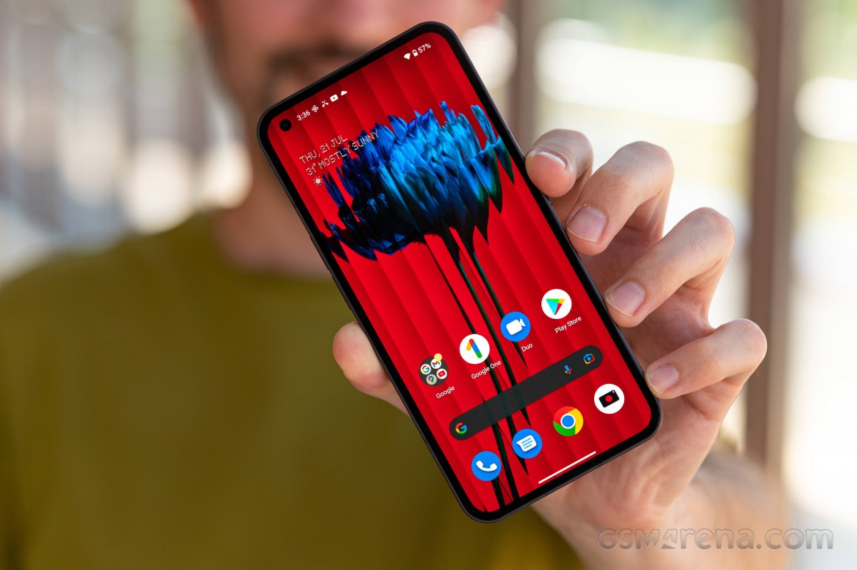
The Phone (1) is supported by popular streaming apps like Netflix and will serve the highest resolution available for streaming quality. Unfortunately, at launch, only YouTube supports HDR streaming. We are hopeful apps like Prime and Netflix will certify the phone soon enough, too.
Haptic feedback
Finally, we want to praise the screen's haptic feedback - it is among the best we've used, with lovely haptics you can feel at the exact spot where you've tapped.
Battery life
The Nothing Phone (1) is powered by a 4,500mAh battery - the same capacity as the Galaxy A52s and Poco F4. It can be recharged via Power Delivery chargers up to 33W.
The Nothing Phone (1) scored a 108h endurance rating. It aced all three tests - calls, web browsing and video playback. The only average component here was the standby.
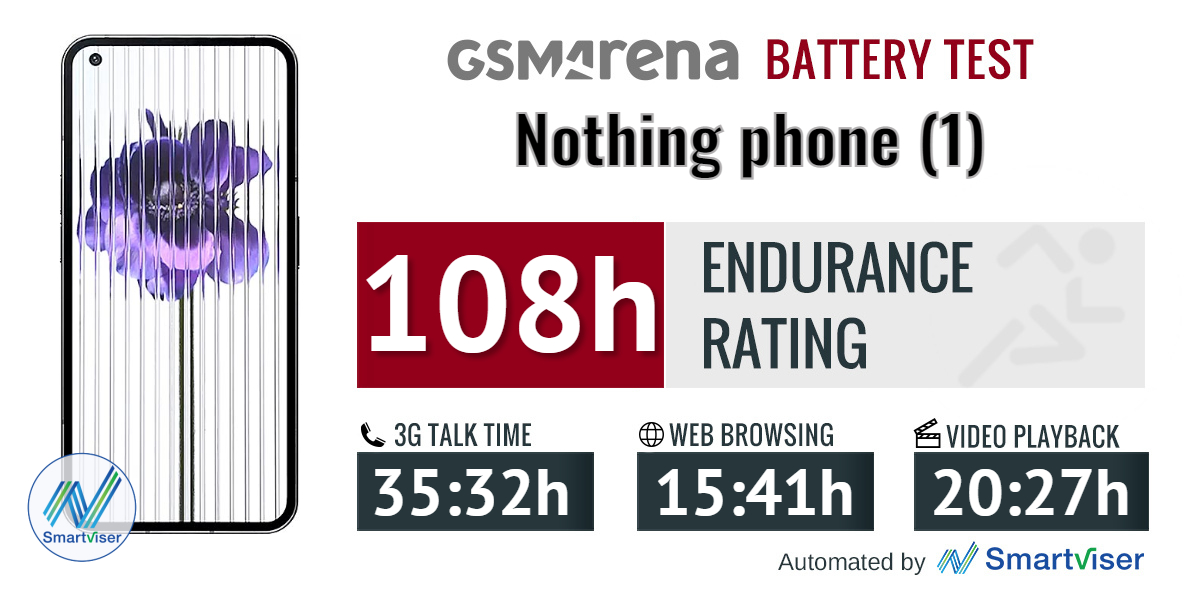
Our battery tests were automated thanks to SmartViser, using its viSerDevice app. The endurance rating denotes how long the battery charge will last you if you use the device for an hour of telephony, web browsing, and video playback daily. More details can be found here.
Because of the average standby performance, the Nothing Phone (1) got a slightly lower endurance rating than other competitors.
Video test carried out in 60Hz refresh rate mode. Web browsing test is done at the display's highest refresh rate whenever possible. Refer to the respective reviews for specifics. To adjust the endurance rating formula to match your own usage patterns, check out our all-time battery test results chart where you can also find all phones we've tested.
Charging
The Nothing Phone (1) supports up to 33W fast wired charging, and it can be achieved with any USB-PD 3.0 charger available on the market. Nothing cites 50% of charge in 30 minutes with such a charger, and we can confirm that.
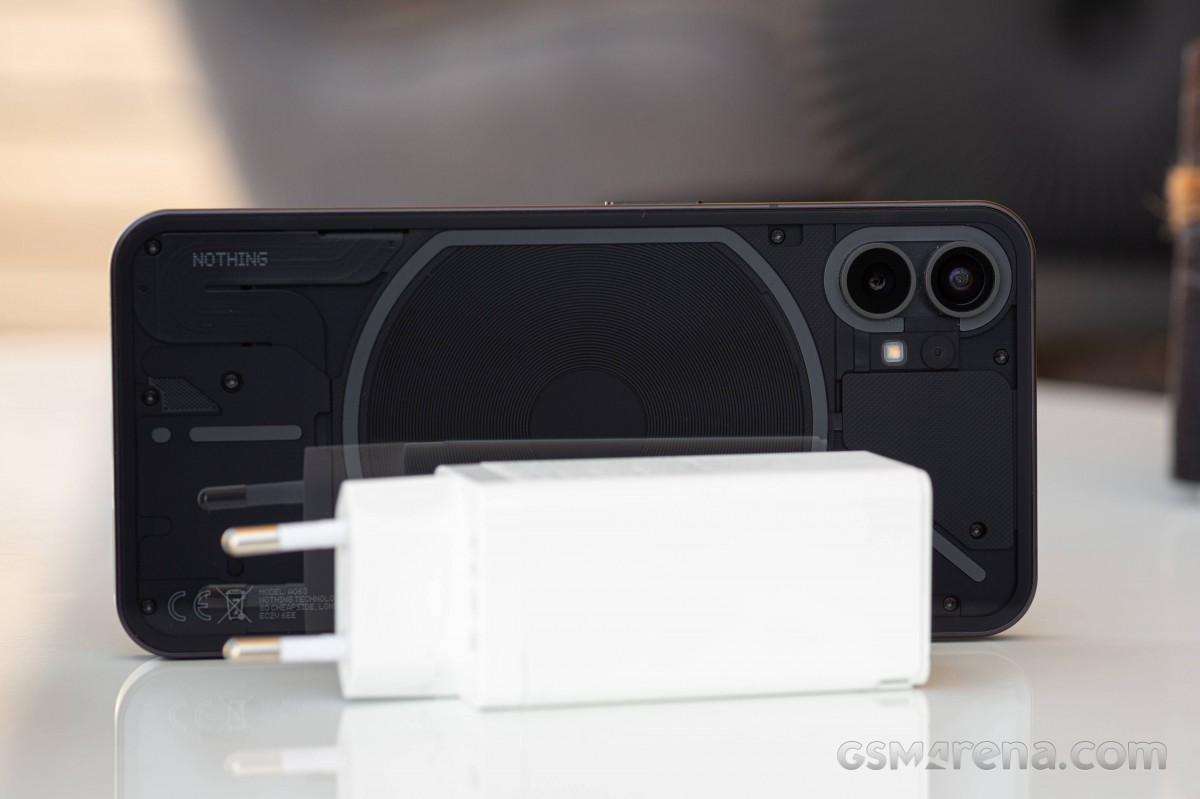
We used a 65W Baseus charger, and it refilled 48% of the Nothing Phone (1) battery in half an hour.
30min charging test (from 0%)
Higher is better
A full charge required 91 minutes, with the Phone (1) noticeably slowing the charging speed after reaching 80%-90%.
Time to full charge (from 0%)
Lower is better
The Phone (1) also supports 15W wireless charging, and you can even wirelessly reverse charge devices on its back.
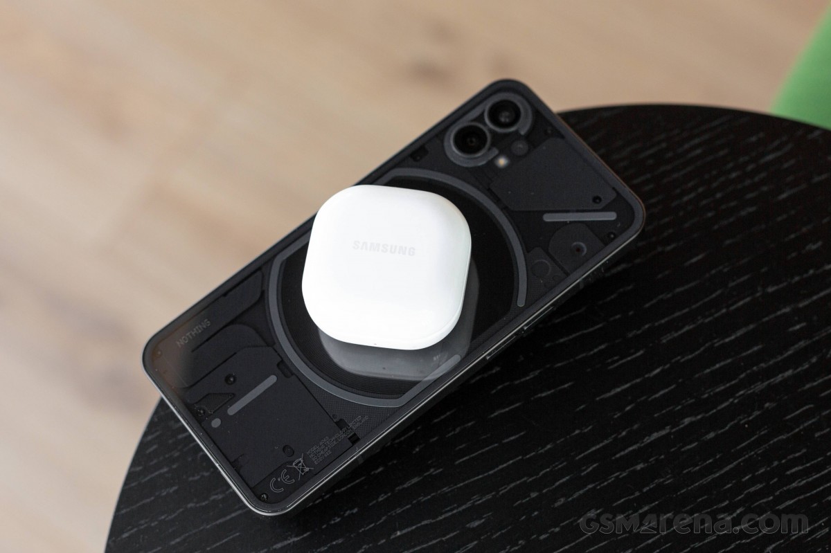
Well, we tried it, and it does work as advertised. You just need to enable Battery Share from within the battery settings.
Speakers
The Nothing Phone (1) offers a stereo speaker setup of the hybrid type. There is a full-blown speaker at the bottom of the phone, while the earpiece acts as a second, front-facing speaker.
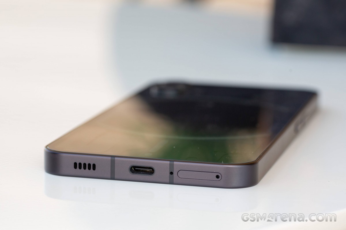
The earpiece is noticeably quieter and lacks bass, unlike the rather loud and bassy bottom speaker. On the other hand, when both are playing music together - they do sound balanced well enough, especially for landscape viewing purposes.
We noticed an odd issue with the speakers, one that we hope Nothing fixes with an upcoming update. The speakers' channels are locked - the earpiece plays left, the bottom plays right - and unfortunately, they won't swap if you rotate the phone.
The Nothing Phone (1) speakers scored a Very Good mark on our loudness test. On the other hand, the sound quality is merely average - the setup plays high
Use the Playback controls to listen to the phone sample recordings (best use headphones). We measure the average loudness of the speakers in LUFS. A lower absolute value means a louder sound. A look at the frequency response chart will tell you how far off the ideal "0db" flat line is the reproduction of the bass, treble, and mid frequencies. You can add more phones to compare how they differ. The scores and ratings are not comparable with our older loudspeaker test. Learn more about how we test here.
Audio quality
It's been a while since we've done this chapter - we discontinued the test in early 2020 because phones became so good that the differences between them could only be detected with lab equipment and didn't really matter in real life.
But the Nothing Phone (1) forced us to do some digging as none of the wired headphones sounded right when connected to it. So we dusted off our trusty old test tool and ran the Phone (1) through it to confirm our suspicions.
And indeed, the Phone (1) has a disastrous frequency response - you can see a comparison to the Poco F4's frequency response below.
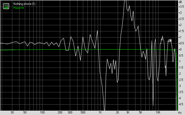
And it's not the only issue either - stereo crosstalk is so high (-3.9dB compared to -85dB or lower for just about every phone) that the phone's stereo effect is severely compromised.
Normally, poor frequency response would point to an equalizer applied, but in this case, it's so shaky that if that's indeed the case, this equalizer must be very, very badly tuned. And even if it existed, there is no option for switching it off, so we are more inclined to believe that the company just generally messed up the software in this part. We certainly hope a fix is coming soon because until then, the audio experience will be severely compromised. Not great prospects for a company whose first product was audio related.
Clean Android 12 with Nothing UI
The Nothing Phone (1) runs on the Nothing OS, an ever so slightly modified version of 'stock' Android 12. Our review unit was running on OS 1.1.0, which was the latest available at the time of testing.
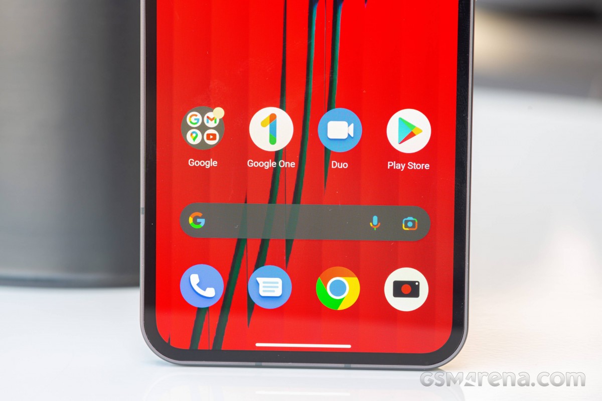
Our Nothing Phone (1) unit received two major updates during the review process - both improving on battery life, Glyph UI, and camera performance. Our review is based on the latest version of Nothing OS - 1.1.0.
Using the Phone (1) does feel a lot like using a Google Pixel. Most of the user interface is familiar, with things like the launcher, the Settings app, and most of the pre-installed apps being identical to what you'd find on Google's smartphones.
The changes Nothing has made are quite selective and judicious in nature. While the phone mostly uses Roboto for the interface, there is also sparing use of the company's distinctive dot matrix typeface for certain UI elements, such as for the headings inside the Settings app, the lockscreen, the charging UI, and the custom widgets.
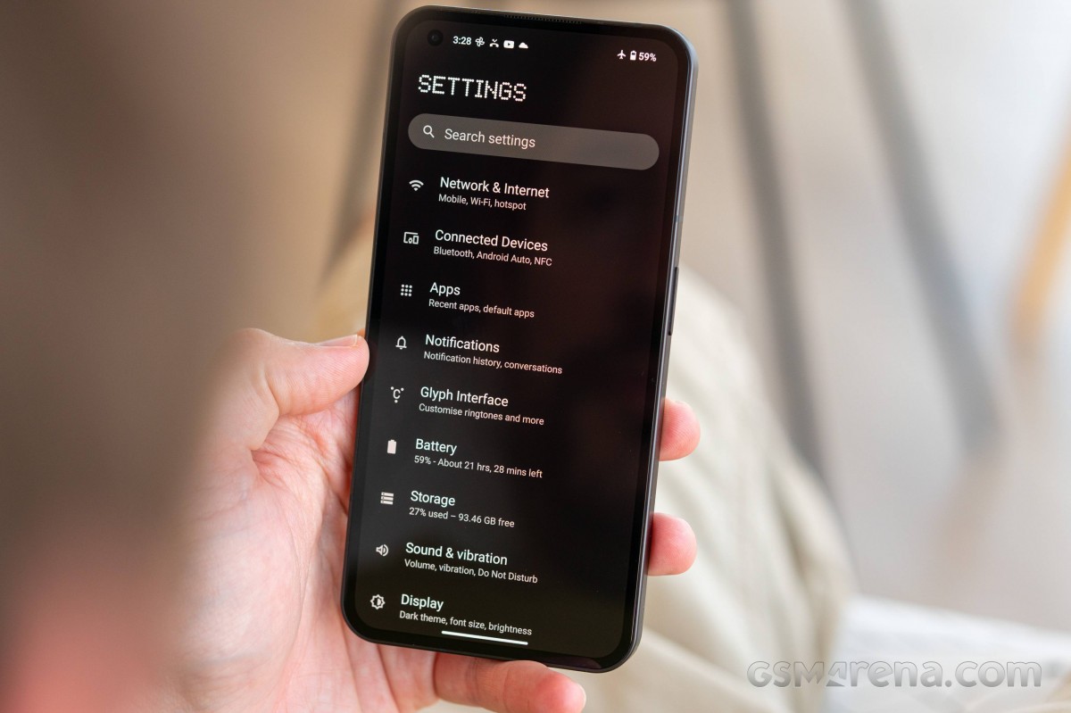
Speaking of custom widgets, there are four on the Phone (1), all of which are variations of the usual clock and weather widgets. There is also an NFT Gallery widget to showcase your NFT collection if you're into that sort of thing. There are four custom wallpapers included, and although the default Nothing icon pack is essentially just the default icons, there is an option to download and apply your own.


Fingerprints • Face unlock • Widgets
Within the experimental features section, there is also a Connect to Tesla option, which is supposed to let you control some features of your Tesla vehicle directly from the phone without requiring the Tesla app. Unfortunately, we did not receive a Tesla with our review unit to confirm if this feature works.


Notifications • Quick settings • Tesla integration
There is also a game mode, but it's not as elaborate as on other phones. You have to manually add games for this mode to kick in, and when it does, it can just enable Do Not Disturb mode and enable mistouch prevention around the edges of the screen. If you have a Nothing Ear (1) paired, it will also enable low latency mode on them.
Speaking of the Ear (1), we didn't see any special integration between the two Nothing products. We had to install the Ear (1) app just like we would on any other phone, and that was how you control the various functions of the earbuds. The experience was identical to pairing them with any other Android phone.
The most custom aspect of the Nothing OS is the inclusion of the Glyph Interface, which controls the LEDs on the back of the phone. First, the feature is optional, so you can just turn it off if it bothers you or if you don't think you will get much use out of it. You can also adjust the brightness of the LEDs, which, as mentioned before, can get seriously bright, even at the default medium brightness.


Glyph • Settings • Flip to Glyph • Ringtones
At present, the Glyph Interface can be used primarily for notifications. The Phone (1) comes with ten custom ringtones for calls and ten notification sounds. Each of these has a pre-programmed pattern assigned to them that plays out on the LEDs whenever they are playing.
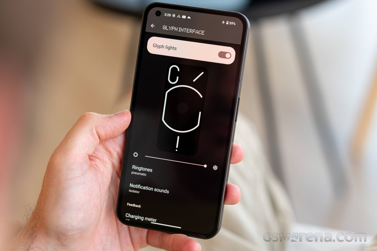
You can add your own ringtones to the phone, and it will try to map them to the different lights, but in our experience, this does not work that well, and usually, the lights will just blink in more simple patterns rather than the more complex animations that you get with the default sounds.
For calls, you can assign a ringtone to each of your contacts. This way, not only do you get audible confirmation of who's calling, but if the phone is placed face down, then the unique light pattern on the back can also inform you of the caller id. Of course, there are only ten custom ringtones, so there's only so many unique callers you can assign them to, but any more would likely be too much to remember.


Charging Meter • Google Assistant • Battery Share
This can also be done for app notifications, provided the app allows setting a custom notification. Some messaging apps will also allow setting a custom ringtone for each contact, but again you are limited to just ten.
Of course, with app notifications, things can get easily out of hand, and it can get quite overwhelming trying to remember all sounds and their light patterns. Then there's also the thing where most apps don't have custom sound alerts, so you will just get the default notification sound and its pattern, which makes it impossible to identify one app from another.
Other things you can do with the lights at present is have the bottom LED bar light up incrementally with the phone's charging status. The lights can also be made to flash when you say the Google Assistant hotword.
The Glyph LEDs can also be activated to act as a fill light for when shooting videos or taking portraits.
Finally, the feature Flip to Glyph is really cool - it's like an expanded silencer. See, once you flip the phone, the Glyph interface will be active (and you will get a glyph prompt for that), while sounds will be silenced.
From what we understand, there are more features planned that will take advantage of the lights on the back. Some users have found a way to make the lights blink with your music by enabling a hidden music visualization feature. These should become available over time through future software updates.
As far as bloatware is concerned, the Phone (1) really has none to speak of, assuming you don't count the ever-increasing mandatory Google apps as bloatware (although maybe it's time we do). The only custom apps on the phone are the Camera app and a Recorder app. The Recorder app has the same dot matrix UI and looks pretty cool aside from offering useful functionality. It can't, however, record calls, and it also cannot be uninstalled if you don't need it.
In terms of stability, the Nothing Phone (1) was surprisingly well-behaved. There are some application-specific issues, such as the YouTube app freaking out when you select 2160p for HDR videos and locking itself to 480p.
That aside, our experience with the software UI was perfectly pleasant and uneventful. Things worked as expected, which is not at all what we expected from the company's first phone, especially since this is an area where Nothing's more established rivals often struggle with. Not to mention the fact that Nothing itself struggled with getting the software right on the Ear (1) even months after launch, so the fact that our Phone (1) basically worked fine after just a single Day 1 update is really impressive.
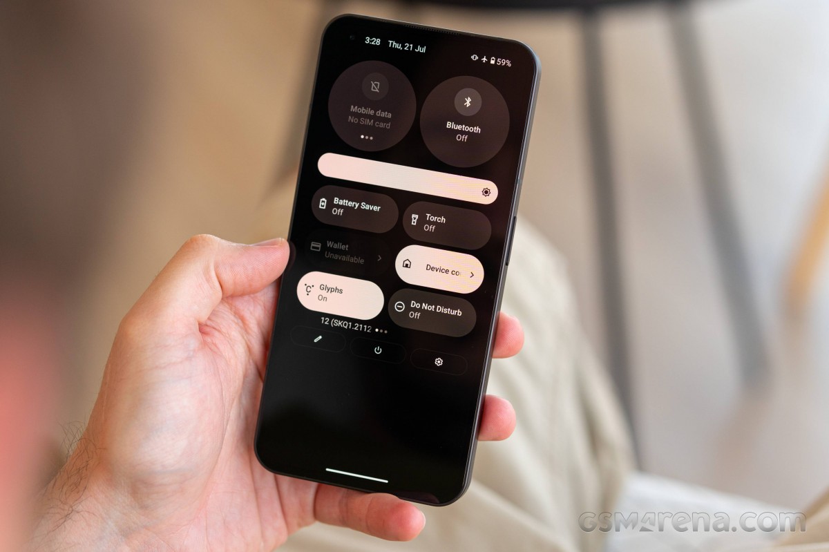
Overall, Nothing gets a lot right about the software experience on the Phone (1). Sticking to near-stock Android ensures a clean and consistent visual experience. The company's own design choices are measured and tasteful. There is little to no bloatware. More importantly, despite being in its infancy, the software was largely stable and reliable. This is a phone we would have no hesitation using on a daily basis or recommending to others looking for a similar clean, user-friendly experience.
Nothing has made a promise for a total of three years of major Android updates and four years of bi-monthly security patches.
Performance and benchmarks
One of the most interesting choices for the Nothing Phone (1) is the chipset - the Snapdragon 778G+ 5G by Qualcomm. It is one of the most powerful chipsets within the top midrange class, bested only by the ex-flagship Snapdragon 870.
We've witnessed a lot of flagships come with incredibly fast hardware that is simply ahead of its time (current gen Snapdragon), or even way ahead of its time (current gen Apple A). Such cutting-edge chipsets are often way overpowered, especially when running 1080 content mostly.
And we can get behind the idea of having a platform that can handle properly the content available today instead of aiming to be powerful after the end of software support. It makes sense for battery life and heat dissipation, for sure.
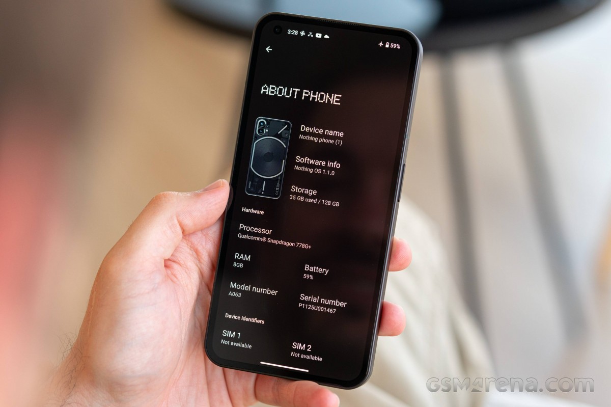
So, the Nothing Phone (1) is powered by the Snapdragon 778G+ 5G chipset. It offers an octa-core Kryo 670 CPU in a 1+3+4 configuration, with a Cortex-A78-based prime core (up to 2.5GHz), three more of those limited to 2.4GHz, and a quad-set of A55 derivatives ticking at up to 1.8GHz. The GPU is Adreno 642L. A built-in Snapdragon X53 5G modem is also part of the package.
The Nothing Phone (1) comes in one of three storage configurations, all with UFS3.1 storage and LPDDR5 RAM - 8/128, 8/256, and 12/256. We have the latter for review.
And now, let's run some tests!
The Nothing Phone (1) processor scored closely to the Snapdragon 870 CPU within the Realme GT Neo 3T and Poco F4 and is bested only by the flagship-grade Snapdragon 8 Gen 1 (Poco F4 GT) and the Dimensity 8100 (Poco X4 GT).
GeekBench 5 (multi-core)
Higher is better
GeekBench 5 (single-core)
Higher is better
The GPU scores are adequate for the class even if they mot as impressive as the latest Snapdragon and Dimensity chipsets. We found the Phone (1) perfectly capable of playing all sorts of games with high-quality graphics. High refresh rate gaming is also possible and achievable.
GFX Aztek ES 3.1 High (onscreen)
Higher is better
GFX Aztek Vulkan High (onscreen)
Higher is better
GFX Car Chase ES 3.1 (onscreen)
Higher is better
GFX Manhattan ES 3.1 (onscreen)
Higher is better
3DMark SSE Vulkan 1.0 (offscreen 1440p)
Higher is better
The AnTuTu tests put the Nothing Phone (1) next to its SD778G peers and not that far behind the SD870-powered phones. The flagship hardware is out of reach, obviously.
AnTuTu 9
Higher is better
The Snapdragon 778G+ chipset also provides excellent stability during long periods of peak CPU and GPU usage. The phone scored 74% of CPU and 90% of GPU stability. It never overheated and even better, its panels and frame, while warm, never got hot.
The Nothing Phone (1) offers excellent performance for its class and price, and there is nothing it cannot do at its launch. Games run smoothly, and we are happy with the quality, performance and stability and multitasking is breezy, too. Even if not powered by top-of-the-line hardware, it will satisfy even picky users with its snappiness and stability.
Dual 50MP camera on the back
The Nothing Phone (1) packs two 50MP cameras on its back - one for standard and one for ultrawide-angle photos. A 16MP camera sits across the opposite side for selfie purposes. The phone comes with a single-LED flash, you can also use the Glyph fill lights in most cases, and there is a small red light you can turn on when recording videos.
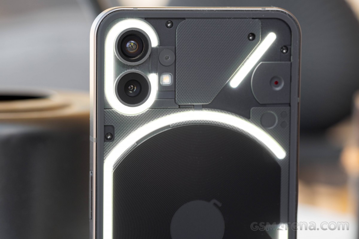
The primary camera on the Nothing Phone (1) utilizes a 50MP Sony IMX 766 1/1.56" Quad-Bayer sensor with 24mm f/1.88 optically stabilized lens, 1.0µm pixels (2.0µm after 4-to-1 binning), and PDAF. This camera shoots by default in 12.5MP.
The ultrawide camera uses a 50MP Samsung JN1 sensor with a Tetracell color filter (Samsung's speak for Quad Bayer). This one is noticeably smaller than the primary 50MP sensor - 1/2.76" type with 0.64µm pixels (1.28µm after the 4-to-1 binning). The sensor sits behind a 14mm f/2.2 lens; automatic distortion correction is always in play. This camera supports PDAF and can focus as close as 4cm away - meaning you can shoot macro with it, and a dedicated macro mode is available.
Both the primary and the ultrawide cameras support an automatic Night Mode of sorts. When the scene is suitable for Night Mode - a moon icon will appear on the viewfinder, but you need to tap it to activate Night Mode. It usually uses 4s-5s exposure time on both cameras. There is no other way to access the Night Mode.

The front camera relies on a 16MP Sony IMX471 1/3.1" sensor with 1.0µm pixels and a Quad-Bayer color filter. It still saves images at the nominal 16MP resolution, which might compromise the quality if you examine the photos up close. The lens is 24mm with an f/2.45 aperture. Autofocus isn't available for selfies.
Camera app
The default Camera app is close to what you'd find across the latest Realme, and OnePlus smartphones use. Swiping on the viewfinder or the scroller below switches between modes, while the additional ones can be found under the "More" sub-menu.
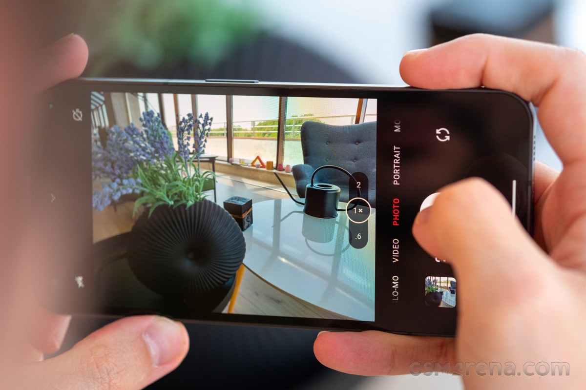
Flash and timer are available on the left side, but you can expand more settings like resolution (12MP/50MP), aspect, Filters, Live Photo, and advanced settings.
Expert mode is also available, and it works on both cameras. The shutter speed can be as low as 30s for the main camera and 20s for the ultrawide cam. RAW capturing is available, too.
Night Mode can work on videos, too, but it's only for the main camera and drops the resolution down to 1080p at 30fps.
You can use either LED flash or the Glyph LEDs across a variety of occasions like video capturing, portraits, photos.
Photo quality
Important: Our Nothing Phone (1) unit received two major updates during the review process – both improving on battery life, Glyph UI, and camera performance. Our review is based on the latest version of Nothing OS – 1.1.0. This recent update indeed improved on the photo quality (mostly with better noise reduction and more consistent color presentation), and we would advise the early adopters to update to the most recent firmware available if not already.
The main camera on the Nothing Phone (1) saves 12.5MP photos by default, which turned out pretty well. There is a lot of resolved detail, the sharpening is not over the top, and the foliage is well-developed. The colors are realistic, even if a tad over-saturated.
We can also praise the contrast and the natural-looking dynamic range (meaning good, but not extreme). Also, the noise is low across all photos, and we think Nothing has done a very good job with the processing, especially since this is their first smartphone.
It appears that our unit has a lens issue on the primary camera that makes for a blurred spot around the middle-left part when focusing at infinity. We think this is a unit-specific problem and not a widespread issue, as the second unit we had (but returned, unfortunately) had no such thing.
The Nothing Phone (1) viewfinder has a dedicated 2x zoom shortcut even if there is no telephoto camera available. The digital zoom, while not considered lossless, is still of high quality as it does more than just a simple crop and upscale.
The 2x zoomed photos aren't as sharp as the default photos, but they present a higher than expected level of detail, and the rest matches the main samples - colors, contrast, dynamic range, and noise.
The portraits taken by the main camera are outstanding - the subjects are well-exposed, nicely detailed and clean of noise. Their separation from the background is quite accurate, even though there is no depth sensor on the phone.
The (adjustable) simulated blur is lovely, too. And we found the colors and contrast easily likable. Indeed, these are some of the better portraits we've seen in a while.
You can switch to a 50MP shooting mode, but it appears it offers 50MP upscales from the default photos.
The 50MP ultrawide camera also outputs 12.5MP photos by default, and the field of view is indeed incredibly wide. The photos have respectable (for an ultrawide-angle camera) resolved detail, likable contrast, and praise-worthy automatic distortion correction. The noise reduction works well, too.
The dynamic range is average most of the time, even if the automatic HDR decided to trigger (recognizable by a small drop in sharpness and a somewhat overprocessed look).
This camera offers realistic colors, sometimes even slightly desaturated. You can easily spot the big difference between the color presentation on the main and ultra-wide cameras. While we received an update that was supposed to fix this (OS 1.1.0), the difference is still obvious. We hope Nothing works on improving them furthermore.
Overall, we are happy with the ultrawide photos as they are of high quality with a ton of resolved detail.
The ultrawide camera supports autofocus, and that's why you can also shoot closeups from 4cm away. These are sharp enough, with pleasant colors and contrast. The noise is low. And if the light isn't enough, you can use the Glyph LEDs to improve it.
We would like to suggest using the main camera instead, as it offers much more natural bokeh (f/1.88 aperture), and it will also offer a more bright, detailed, and colorful photo. Sure, its focus limit is about 10cm, but as you can see - the photos are quite likable.
Finally, you can also shoot 50MP photos with the ultrawide camera, too. And just like the ones from the main shooter, these are simple upscales from the regular images.
The 16MP selfie camera uses a sensor with a Quad-Bayer filter, meaning its default resolution should be 4MP. It is not, though. The processing upscales the photos back to 16MP, and that's why none of the selfies look perfectly sharp.
They are still pretty good, though. There is enough detail not to call them soft, while everything else is great - colors, contrast, dynamic range, and noise reduction.
The selfie portraits offer proficient enough separation, pleasant blur, and colorful and well-developed subjects.
Low-light photo quality
There is Night Mode available to all cameras, but its trigger appears only when the conditions are suitable for Night Mode (meaning in low light). You cannot control its exposure time (usually 5s); you can just choose whether to use it or not.
So, the standard low-light photos from the main camera are excellent. They offer true to life look with realistic exposure and acceptable dynamic range. The resolved detail is plenty, the color saturation is pretty good, and the noise reduction strikes the perfect balance between noise and detail.
Some blown highlights are noticeable but other than that - these are some solid low-light samples!
The Night Mode improves the exposure and makes for slightly brighter photos with punchier colors. It exposes more detail in some shadows and reduces the blown highlights. While a bit unrealistic, the Night Mode photos are probably the ones, you'd want to share with your friends.
The 2x zoomed samples shot without Night Mode are pretty good - they are bright, colorful, sharper than expected, and with well-handled noise. Some smart upscale seems to be at play here, and we do like the result and suggest using zoom if the scene needs it.
Using Night Mode on the 2x zoom level will drastically lower the detail, and the images become incredibly soft. They get improved exposure and colors, but we don't think it's worth losing all the sharpness.


Main cam 2x zoom with Night Mode
The default ultrawide photos taken at low light are great, speaking volumes for the quality of the camera and its processing. There is more than enough resolved detail; the color saturation is kept natural, and so is the brightness. The noise reduction is once again spot on - not too harsh and not too gentle.
The Night Mode drastically improves the exposure of the ultrawide photos and boosts the colors, but at a price - a noticeable drop in the resolved detail, overprocessed look and visible image artifacts.


Ultrawide camera with Night mode
And here are photos of our usual posters taken with the Nothing Phone (1). You can see how it stacks up against the competition. Feel free to browse and pit it against other phones from our extensive database.
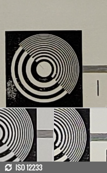
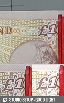
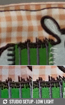
Nothing Phone (1) against the Galaxy A52s 5G and the Poco F4 GT in our Photo compare tool
Video quality
The Nothing Phone (1) captures videos with all its cameras. The main and ultrawide cameras record videos up to 4K at 30fps, and there's 1080p at both 30fps and 60fps. The selfie shooter is limited to 1080p@30fps video capturing.
You get the option to choose between the h.264 and h.265 codecs.
Electronic stabilization is available - it is optional for all rear cameras and works on all resolutions and frame rates. The primary camera also benefits from OIS.

The Nothing Phone (1) is quite generous with the bitrates - the 4K footage gets 57Mbps, while 1080p/30fps is allocated a similarly above-average 20Mbps when using the h.264 codec. The audio bitrate is about 96kbps. The sound is stereo. Despite the seemingly low bitrate, the sound appears to be good, if not great.
The 4K clips we shot on the main camera are great - they offer plenty of resolved detail but with the right amount of sharpness and make for a natural look. The noise is low, the colors are lively and true to life, and the dynamic range deserves praise.
Do not forget that the primary camera on our unit has a lens issue; that's why you can see a soft spot on the left part of the video.
You can shoot 2x zoomed videos, but they are a simple digital zoom, and while sharing all the good qualities with the standard clips, the resolved detail is halved.
The 4K videos from the ultrawide camera are pretty good, too. There is a lot of resolved detail, the contrast is okay, and the noise is low. The dynamic range is average, and the colors are a bit muted, but overall - the video quality is solid, especially for an ultrawide-angle camera.
The 4K clips from the main camera at night are okay with enough detail, realistic exposure and colors. The noise is handled well.
Night Mode video is always shot on the main camera and in 1080p resolution at 30fps. It offers an improved exposure resulting in a brighter picture, and the color looks a bit better.
The low-light videos from the ultrawide camera are rather dark (because of the f/2.2 lens) but are not ruined by noise. If there is a certain occasion at night where you need to shoot with this camera, it will produce usable footage.
Finally, here is the Nothing Phone (1) in our video tool so you can make your own comparisons.
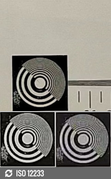

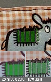
2160p: Nothing Phone (1) against the Galaxy A52s 5G and the Poco F4 GT in our Video compare tool
The competition
Nothing has done an incredible job with its first-ever smartphone - the Phone (1). We found its screen, performance, camera quality, battery life and charging speed to be up to par and its design and Glyph UI - interesting and useful at the least. The handset starting price is €469 for the 8/128 model and €499 for the 8/256 version - which we consider quite reasonable.
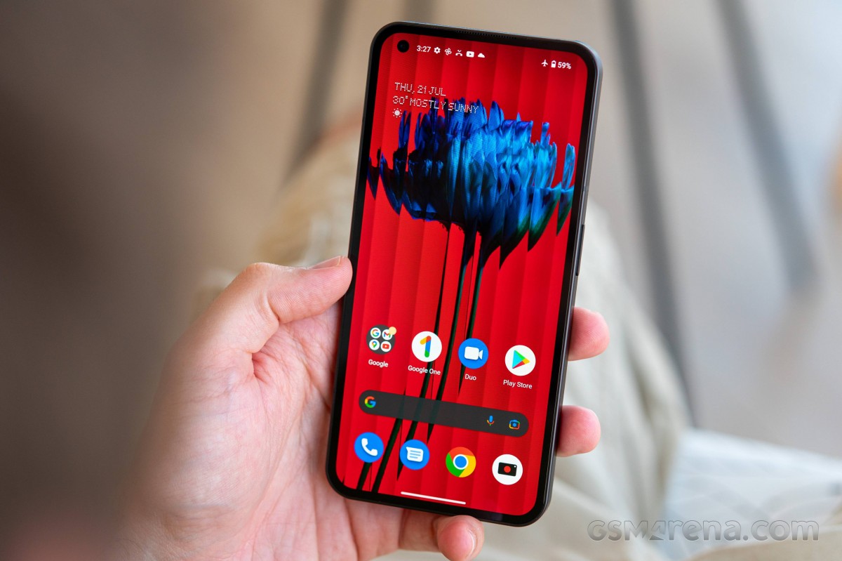
There are quite a few similar offers on the market, and while none of them will offer an alternative to Glyph or a similarly innovative feature, they will surely make you think and weigh your options before choosing the one that's right for you.
Let's start with one of the most obvious choices, one that will probably go out of stock in a couple of months, and that's why now is the best time to get it. Yes, we are talking about the €300 Samsung Galaxy A52s 5G. This Galaxy has the same screen and chipset, equally powerful battery, and similarly capable cameras. The Galaxy A52s design isn't as cool and has no Glyph, obviously, but it is IP67-rated for dust and water resistance, and considering its noticeably lower price, it is an outstanding offer.
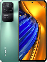
Then there is the Poco F4 GT, currently sold at about €499 with the Xiaomi discount. It is one of the best offers for gaming on a budget - the F4 GT packs a large OLED with 120Hz and 1B colors that sits on top of the most current Snapdragon 8 Gen 1 chip. There are dedicated physical gaming buttons on the side, incredibly fast 120W charging, four loudspeakers, and reliable camera performance. If gaming is what you are after, the Poco F4 GT is the phone you get in this price bracket.
The Realme GT Neo 3T is priced at €430, and it also makes for an excellent alternative. It offers a similar screen, a bit faster performance, an even larger battery with fast 80W charging and a bundled power adapter. Its camera department is of lower quality; there is no splash resistance and no Glyph UI. And the interface is Realme UI instead of the clean and snappy Nothing OS. If we had to choose, we'd probably get the Nothing Phone (1) for its cooler design and features.
Finally, we cannot but mention the €399 OnePlus Nord 2T. While its OLED display isn't as snappy at 90Hz, its Dimensity 1300 should be offering better performance. The battery capacity and the camera department closely match the Phone (1). Yes, the Nord 2T price is about €60 lower than the Phone (1), and while it's a theoretically faster phone, you get an inferior design, no Glyph UI, and a slower screen.
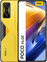
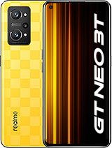
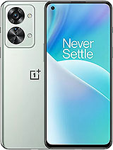
Samsung Galaxy A52s 5G • Xiaomi Poco F4 GT • Realme GT Neo 3T • OnePlus Nord 2T
Our verdict
The Nothing Phone (1) is a smooth start for the maker and presents a great smartphone with a thoughtful pick of features and a pinch of innovation. It is neither the fastest nor the greatest smartphone, but it's fine as it costs half or even less than one.
We have to admit we were skeptical about where the Nothing phone was going during the rumor season, but we couldn't be happier that we were wrong, as things went for the better.
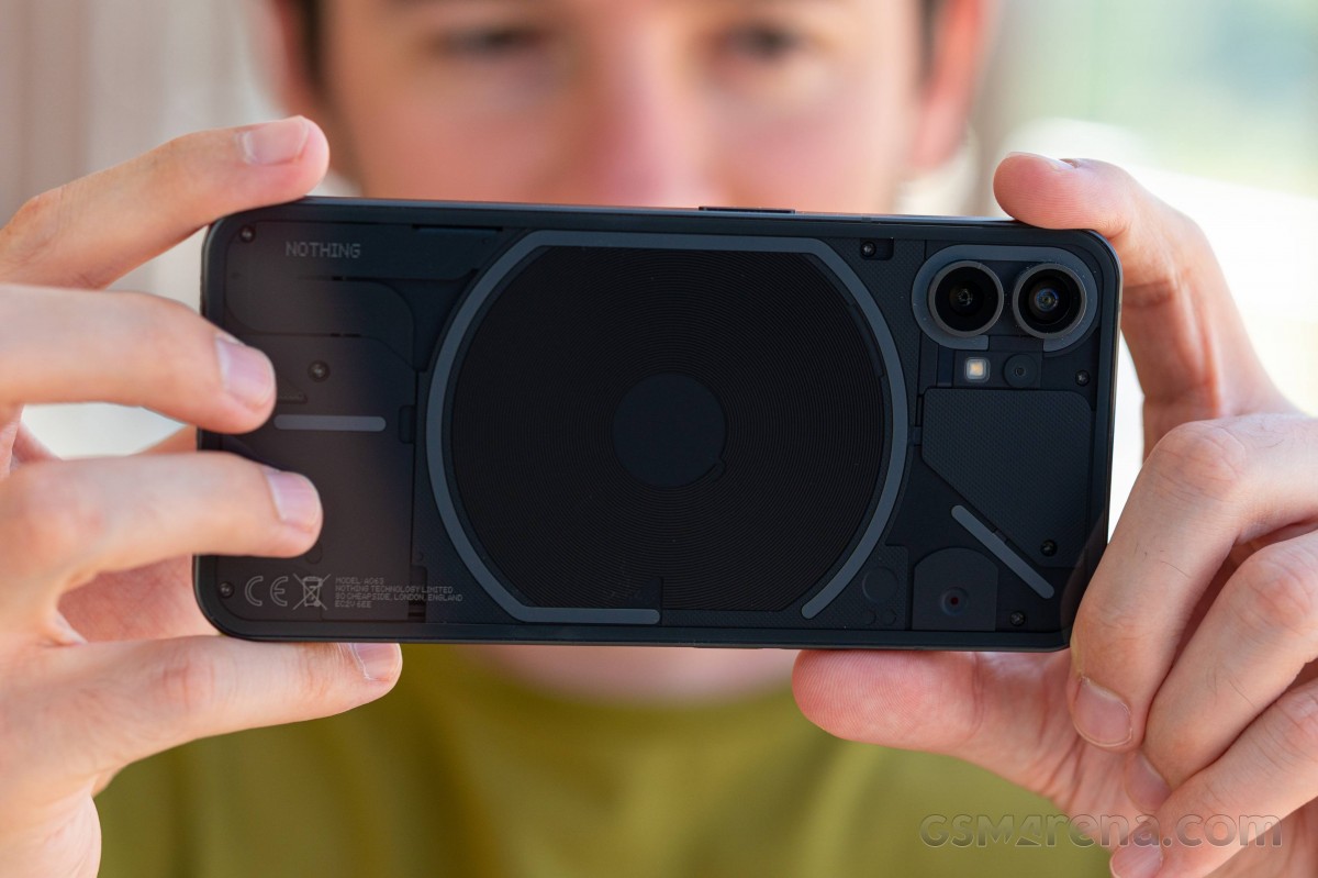
The Nothing Phone (1) impresses with its design and see-through back, and the Glyph UI is more than just a gimmick if you give it a chance. The OLED display is of excellent quality, and once you start using that snappy Android on it, we are sure you will love it just as we did.
Even better, the Nothing Phone (1) offers gaming-friendly performance and great stability, and we found its camera department to be of premium quality.
It is not a phone without issues - the audio quality turned out bad, and the top speaker is rather quiet. We do hope Nothing will fix the audio with its next update.

We would have appreciated complete water protection instead of basic splash resistance, too, but maybe this would have cost too much, who knows. We do wish it for the Phone (2).
And speaking of Phone (2), we think the Phone (1) has already paved the way for a series of great phones with snappy performance and unique Glyph backs. The first ever Nothing phone left us with overly positive impressions during its time with us, and even with a few setbacks, it's an amazing launch!
So, we do recommend getting the Nothing Phone (1) for its uniqueness, speed, and camera as they come at a competitive price. Yes, it's not a top-tier phone, but it does feel and behave like one, and while it's not a flagship killer, it sure isn't a glorified mid-ranger either. Good job, Nothing!
Pros
- One-of-a-kind glass design with Glyph UI, IP53-rated.
- Outstanding HDR OLED, 120Hz, superb color accuracy.
- Reliable battery life, fast enough charging.
- Up to par performance, great stability.
- One of the snappiest Android interpretations.
- Excellent main and ultrawide cameras, day and night, photo and video.
Cons
- Weak ingress protection.
- Horrible headphone audio quality.
- Quiet top speaker.
- No charger in the box.
| 256GB 8GB RAM | ₹ 34,999 | $ 498.99 |
| 256GB 12GB RAM | ₹ 37,999 | $ 548.99 |
| 128GB 8GB RAM | ₹ 32,999 | € 469.00 |










No comments:
Post a Comment